Today's daily sketch. Ace of Pentacles--reversed

15486820807563589253188855785064.jpg

Today’s daily card is the Ace of pentacles—reversed. Which means I need to look at how my physical environment is affecting me, and how I am affecting it. What is the financial situation? Am I doing what I should for my own health and mental well-being? So while I was contemplating the different meanings of the card, and how I felt about it, I did a google search for a decent image to work with. And this came up from National Geographic

1548681980693911716628394836860.jpg

An interresting view of a dam, and how humans have shaped our environment. Many images, of course, came up, but this was the one that grabbed me.

so I did the first step in each of my sketches and wrote my thoughts and musings about the card on to the watercolor paper. I used a prismacolor pencil today instead of standard graphite. It felt like a yellow ochre sort of day

I worked a lot with indigo blue and gold. as well as a bit of orange because the image needed it. and here is the result.

20190128_094548.jpg

Have a great day!

Daily sketch

Today's daily sketch is based on the idea of wind or air, like yesterday's was based on fire.

It partially works .  I think the background needs to be even paler  than it is now .  Also,  the surface  decoration , basically the dark focal area of the piece,  needs to be darker  and more defined.  


upload.jpg

Daily sketch

upload.jpg

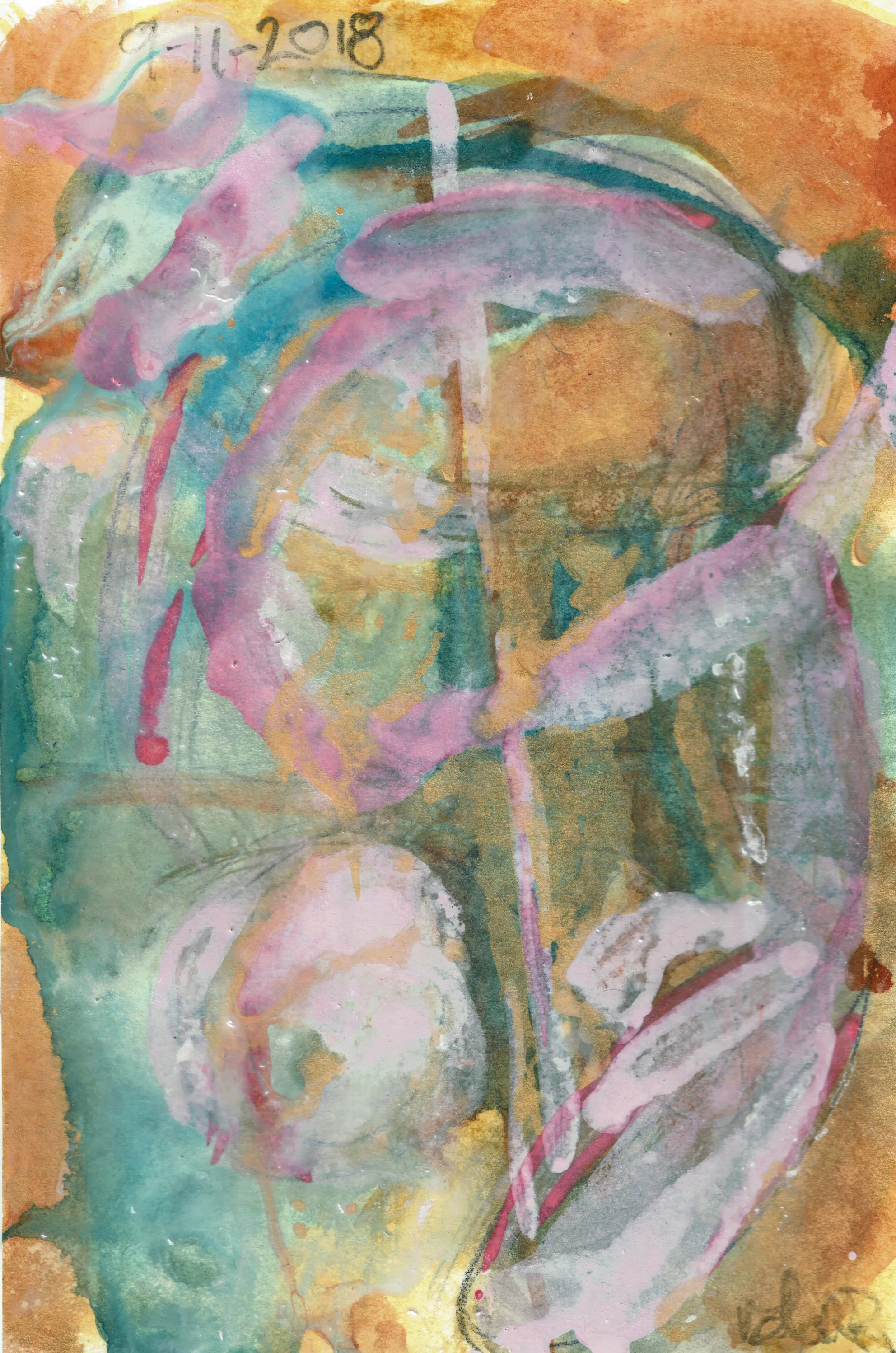
Today's daily sketch. It was looking a little like christmas wrap for a bit. Thankfully adding the last layer mellowed it out, and made it come together. 

I'm trying to develop a language of marks, and symbols that is consistent. Currently I'm thinking that triangles are a good representation for fire or flame. Circles and ovals for water and squares for earth. For air I think it's going to be those diddly marks I like so much. 

Also, I'm trying to work on my color theory. For example on this piece, it turns out that green, no matter how muted or earthy is not a suitable complement to red-orange. Dark gray and purple are. Just like yesterday's post, blues go better with yellows, and yellow ochre. I think this more of an emotional thing, not a visual thing. 

I find that chalk pastels are becoming my favorite base layer. it's just such a nice surface to work on. 

Now, time to get back to the stitching. 

Daily sketch

Today's turned out pretty well. The gold gel pen moves with the watercolor brush, more than I thought it would. It's made an interesting, obscuring, layer of sparkle. The text is one of the psalms in latin.

I was debating if it needed some true white highlights.  

This is an idea I'll be revisiting. 


upload.jpg